Goals:
- Identify user pain points during integration and early product onboarding, and define solutions;
- Reduce support load during account connection;
- Unify integration screens visually and align the flow with updated requirements.
Short summary: support tickets during connection dropped 14x; we also discovered a large set of hidden product issues and prepared a structured remediation plan.
Context
iGMS is a system for managing listings across Airbnb,
Registration, integration, and onboarding had evolved incrementally over years, across different teams, without a holistic redesign. This created fragmented UX, inconsistent components, and unclear process structure.
The trigger for the project was weak conversion, high churn, and new integration requirements from external platforms. We decided to redesign the entire connection journey and investigate root causes.
Process
After aligning with leadership, I collected and reviewed everything available: support complaints from early-stage users, legacy and unreleased UI versions, API integration docs, prototype descriptions, and process diagrams.
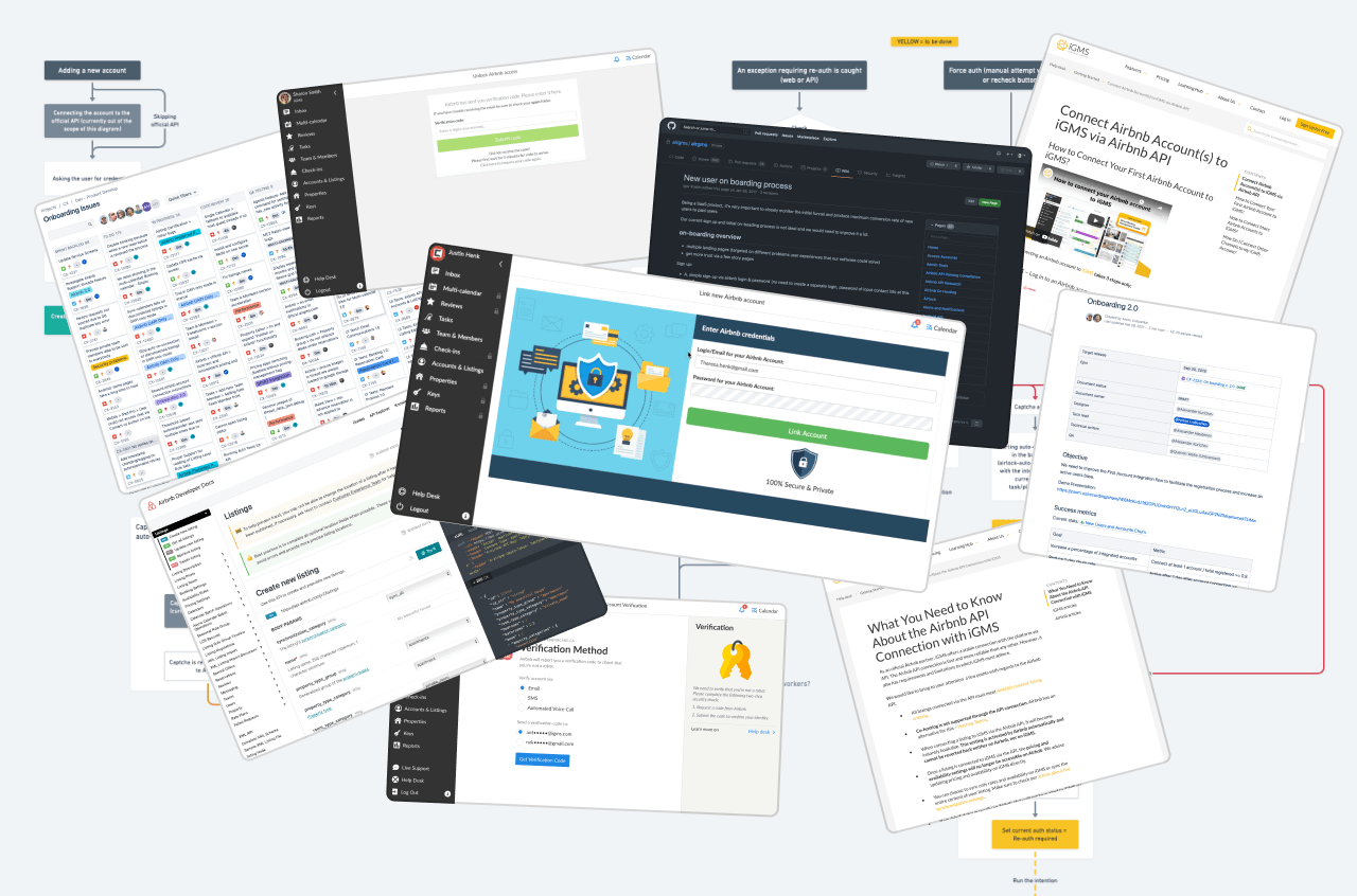
Google Analytics alone was not enough, so I coordinated adding FullStory for session recording and behavioral analytics. This revealed many hidden friction points.
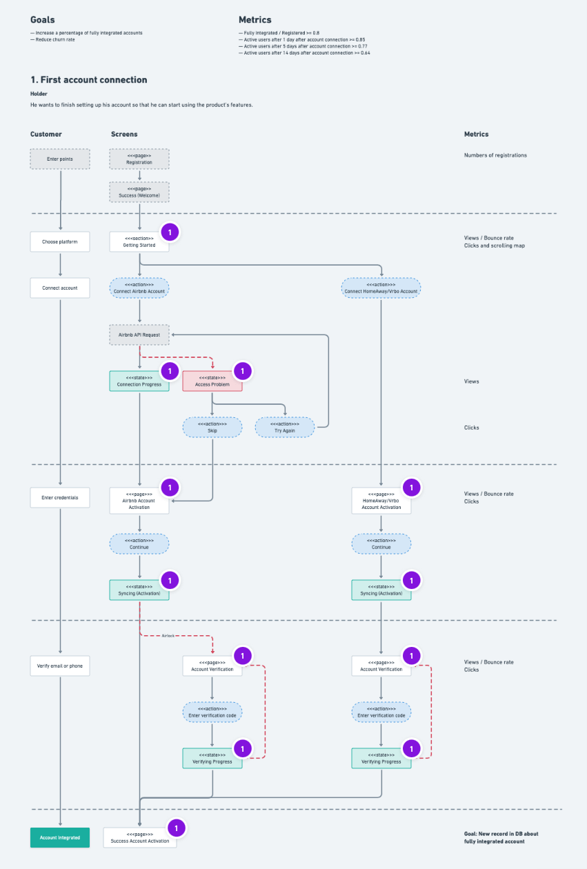
Next, I mapped what customer data we already stored and aligned a clear KPI set to evaluate the redesign.
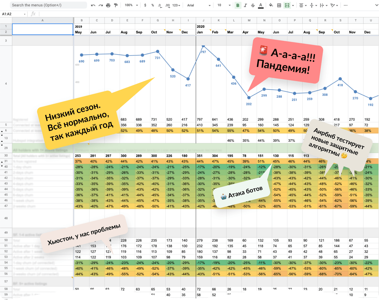
I built SQL queries and regularly extracted database snapshots. Then I created a KPI visualization table in Google Sheets to track conversion and churn across user cohorts. This report remains an active product health dashboard.
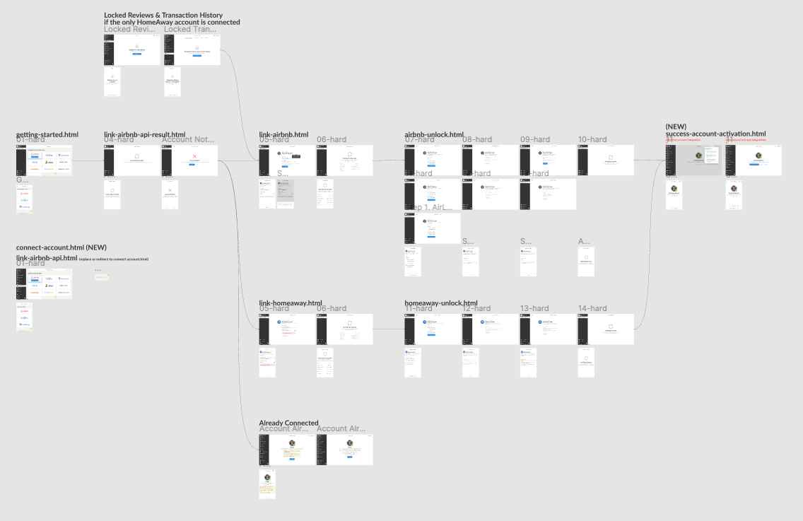
With enough data, I designed two user-flow maps: current and target.
The current-state map included funnel metrics and explicit issues per step, which helped us prioritize the first set of changes.
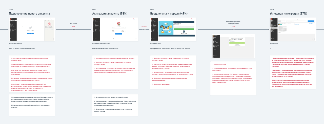
The analysis confirmed significant friction both during and after integration. We improved communication with churned users via surveys and support outreach in chat/social channels, and documented feedback in the internal knowledge base.
After several iterations, we aligned the target flow.
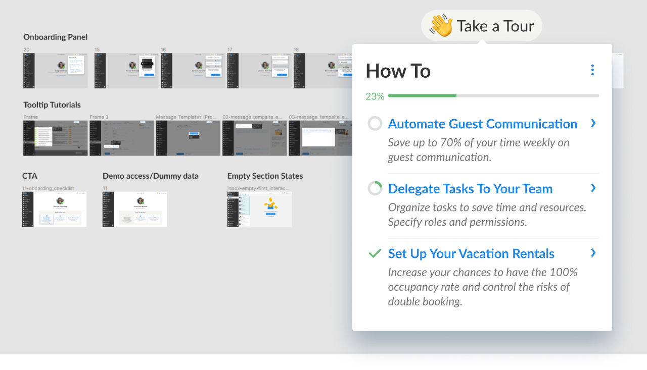
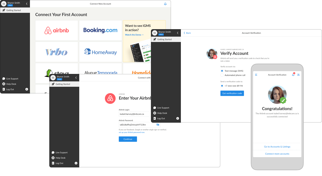
Based on that flow, I prepared a clickable Figma prototype covering multiple connection scenarios and several onboarding concepts to guide users in an unfamiliar interface.
Due to limited resources, we prioritized integration-flow optimization and reduced onboarding scope to lightweight contextual hints. Broader onboarding ideas were documented for future roadmap cycles.
After approval, we moved to execution:
- assemble final screens from existing components;
- review copy with a native speaker;
- document new flows internally;
- review implementation plans with engineering;
- present to support and marketing teams;
- run multiple design-review iterations;
- finalize analytics instrumentation;
- prepare marketing assets and Help Desk updates;
- monitor metrics bi-weekly and report outcomes across 2 weeks, 1 month, 2 months, and 6 months.
Result
The project launched in March 2020 during the first major market impact of
Despite the crisis, conversion indicators improved. Users completed onboarding more independently: support requests at this stage dropped from 14% to below 1%. The biggest contributors were cleaner UI, clearer visual hierarchy, and fewer steps.
The new hint block with short animated guidance was well received: nearly 20% of customers use it to explore product capabilities, and about half of them try those steps during the first session.
With session analytics and churn-user interviews, we identified many issues beyond integration itself. I documented them and aligned conceptual solutions with leadership; final implementation was scheduled for future roadmap stages.